Initial Research- Magazine Covers and Posters
Film posters - 'Super 8 '


This film poster applies to the genre of the film, which stands out as a thriller and possibly sci-fi. It is a dull coloured poster and doesn't use colours or colourful images, but uses a large background image. The main image is of a landscape which looks shadowed and gloomy which means the film would be based on that place and the people you can see on the horizon. The main image is tilted to the side on the poster. The font is big and bold and stands out on the background which is dark, the font is really bright but plain and is almost lit up, this draws the readers in. The genre of this movie poster is different to mine but the conventions of the poster are effective and useful to me. The picture is like a silhouette in the distance and the only bright part is the light in the distance from a water tower. This is like a symbol for the film and is hiding something which will anticipate the audience. The poster on the right is the same film but a more detailed and symbolic poster, which has a similar setting to it, it is dull and looks like they are in danger, and has something to do with a film or a camera reel, the two posters have the same effect, we also see the characters who are children. The characters in the poster look focused and have an enquiring expression, and we see a camera lens shining over the characters in the background, this shows us that it has significance. The creators' names are bold and clearly shown on the posters, this tells the audience that it will be a big film as it made by two well known famous directors who are successful and have popular films, the date is again a key part of the poster and is bold and stands out. We also see flames and a mans face which we can only just see and looks distorted. It also uses a good tagline which is "it arrives" this is also hiding something from the audience and is something which will encourage them to see it. The images are all placed in the centre of the poster as they are the biggest and the small pictures are organised around the edge of the poster.
Magazine Cover - 'Transformers 3'

This magazine cover stands out as it uses images scattered all over the cover, the different images to attract readers, it uses large fonts and small captions on the cover. The fonts all use similar colours but main words stand out in yellow, the font is organised and is all the same, apart from the masthead. The main background on the cover would attract the reader as it is a big film and is the main part of the magazine, it is effective as it is a large imag behind the characters and creates a setting for the film on the cover. The text is all in the same font and stands out. The magazine contains colours and special effects from the film whcih will automatically grab the audience. We also see a big explosion in the background which tells the audience that it is an action packed film and will be a big hit film, enticing people to see it, therefore the magazine cover is a good effect. The cover has included the text, 'Blockbuster issue' which would appeal to fans and readers as they would want to go the films and read about them in the magazine. The bold white font is striking and clear to see, which is a good way of grabbing the reader's attention and the small yellow writing wouldn't stand out if it was normal so the alternating colours is a good effect. The masthead stands out as it is in red and different to everything else on the cover. We know that the magazine is action packed by the images, font and design that is used. Everything was crammed onto the front and grabs the readers attention.
Movie Poster- 'Paul'

This poster attracts viewers to the film with the use of actors and the tag line, the tag line is a useful part of the movie poster as it shows a comedy catchphrase or quote for the film. The title of the film is bold and is bright as it is on a dark background. The image on the poster is effective as it uses a spotlight which applies to the alien in the film but also puts the main attention on the three characters in the film. It also shows the date as Valentines day which tells the audience that it would be a good comedy for couples to go see and therefore reaching a wider audience. This movie poster shows that it is a comedy, and we know this because the alien is almost human like and is holding a cup in his hand and is wearing trousers and the characters don't look like heroes and look friendly to the alien. We also know that it is a comedy film by the way that they include, the text 'from the producers of Hot Fuzz which audiences will know is a comedy film, and uses the same actors from that film and fans from that film would be drawn into this one, this also tells the audience that those films were successful and that this could be popular. The way in which the film title is a name tells us that it is a comedy as it is aware to the audience that the alien is called 'paul' and its a normal name for something that's not normal. The two characters on the poster look confused and shocked as they look up towards the light, as with the alien he looks more confident and welcoming, and seems to know what the spotlight is which the audience would automatically think is a UFO.
Magazine Cover - 'Inception'

This cover uses a strong colour and large image, and a large silver text for the name of the film, this automatically draws the reader in. The background image stands out and applies to the film. The use of the large image and the black suit shows that this film could be action and thriller, and the use of weapons will be involved, also this tells us that it could be a spy film with the use of the suit and pistol. The small cover lines used on the cover is highlighted in red and white to show the important words used, they are all simple font and stand out. They stand out on the strong background as they contrast against the blue colour. The subtitle on the magazine signifies the issue and is large and red and above the masthead and entices people to buy the issue. The text is very central and therefore grabs attention of viewers, but the image is the main attraction for the magazine as it represents the genre of the film. The cover signifies the film as a mind-blower and a mind-trip, this tells the audience that it is a good film and that they should go see it, it also tells the audience it is a film different from expectation and physchological. The black text also gives this effect as it looks like it is scrolling out of the screen and suits the background. In the background image we see the street and a city landscape but at the title of the cover we see the rooftops and a Birdseye view of the city. The character on this cover looks focused and serious and prepared for something. The tagline on the cover tells the audience that the film could be spy or espionage as it mentions james bond which is a popular spy franchise and the way it says 'The matrix meets 007 on steroids" this hints that the film could have the special effects of a matrix film and the spy theme of 007.
Film Poster - 'The Dark Knight'

This movie poster was for the blockbuster 'The Dark Knight', the poster symbolises the gritty and violent setting of the film due to the image on the poster. It has one of the main characters on the poster, a violent character which the audience can tell due to his appearance and him on the poster itself. The audience know this because he is holding a weapon and there is an explosion happening with debris and sparks flying, this shows that he is the antagonist and that it is an action filled film. The city can be seen in the background of the poster and is dark and shadowing, but blends in with the character on the poster and the explosion going on around him. The appearance of the character shows he is sinister and that he is the villain as he is dressed in purple and is wearing makeup on his face to make him look like a 'clown', and has green messy hair, with a fake smile on his face, but is more sinister and evil compared to a clown and isn't really smiling, this is to make him look frustrated and strong, he also appears to be clenching his fist this also shows anger and despair. The actors names are on show and are placed at the top of the poster, therefore they can be easily seen and would draw viewers in. They also display the date quite bold and clear, therefore again people are aware of the release date. The use of 'depth of field' is used as the landscape is distant and unclear.
Movie poster - 'Vantage Point'

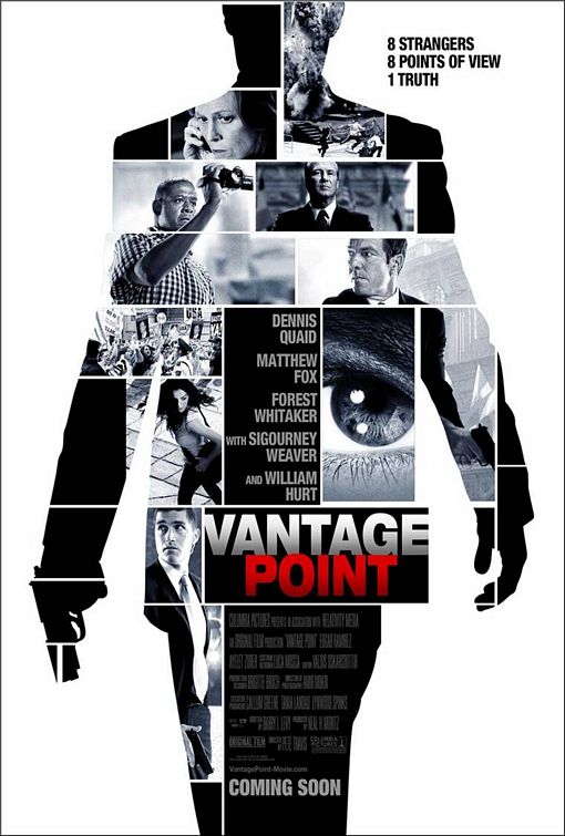
This movie poster applies to the plot of the film and to the tag line on the poster, the silhouette of the figure on the poster is divided into different people and perspectives, this shows the audience that it is set on a shooting in the perspective of different characters in the film. Also the title of the film is positioned centrally and stands out the most as it is a bright and colourful text compared to the image which is in black and white, the title stand out as it is the most important text on their as it tells the audience straight away that someone has a vantage point over everybody else and that they are all vulnerable. This layout and the tag line would attract viewers. It also puts the actors' names in the centre of the image as it would attract fans of the actors and has a list of well known actors. The billing block is included and is smaller and harder to see, which focuses attention on the rest of the poster. All the small boxes contain an event going on and different people witnessing or hearing the event, they look frightened and serious. The poster doesn't use a date, but says 'coming soon' this is to build anticipation for the audience. The big main figure is almost like something from a bond movie, therefore would tell the audience that there is an espionage side to the film. The design of the poster is in a point of view style which relates to the movie. We also know that it could be an action film as some of the pictures there are shots of explosions and weapons which tells the audience to expect some violence and thrills.
Magazine Cover - 'Cowboys & Aliens'

This movie magazine cover is bright and stands out compared to some others, it uses bright blue colours and is in the perspective of being in the sky, and the title of the film is like its lit up which suits the image of the cover, the character on the cover looks like he is from the cowboy era by the way he is dressed and the old weapon he is using, hence the name of the film and is surrounded by futuristic things like planes, lasers and lights and looks like he is standing on something high up in the air, through these things we can tell the film is sci-fi and action and can be easily identified by the audience. The shot is a full body shot to show the whole character to give the reader an incite into the character. His stance and facial expression make him look dominant and powerful, and the idea of him being high up shows us this as well as his stance and face. The text and font is large and bright and all is standing out, this helps to grab attention and get more potential readers. The subtitles and other text is all positioned to the edge of the magazine away from the central image which grabs the attention along with the title of the film and the use of the actors' names ands characters grabs attention as they are well know characters and films. They also focus attention on the additional text on the cover by highlighting it from other text. The cover uses alternating colours again so that everything looks organised and stands out and is bright and bold.
My Chosen Genre: Horror
Empire - 'Hannibal'

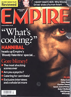
This film magazine is easily identified as a horror cover, due to the large intimidating image and the layout of the front cover. It has a left hand side third alternating in red and white. The magazine has a dark background with the font large and red, and the word 'hannibal' (the name of the film) is in red, this almost represents the image of blood, and adds the horror effect and tells the audience that it is a horror film as a cannibal would only be associated with a scary film or violent film, and resembles the word 'cannibal'. The masthead is also in a bold and red, this stands out and therefore the reader will easily distinguish the magazine from others. The use of the image is useful as it creates a scary, gloomy character for the readers to see, and will entice them to see the film and what he is in. It only shows the face of the character and hides the rest of him. The magazine uses violent related words which draws readers in. We also see that the eyes are red, which shows he is the villain and has an 'evil' plan or lifestyle, and also has a smirk on his face which means he is sinister and planning something. The dark background has consumed half of his face and tells the audience that he is hiding something or has two sides to his personality, this the audience will want to know.
'Scream'

This poster is very effective at giving the audience the encouragement to see the horror film; 'scream'. The large face represents the scary effect. The face looks scared and worried about something, which the audience want to know. The face is pale and has a lack of colour, this shows the gritty violence the film could contain. The title of the film is easy to see, it is bold and white and stands out from the background image. Also the image looks shadowed, like the person is hiding or shadowed by fear, the poster also uses a tagline which is located at the top and this too is in white, but stands out. The names are small and located under the title. The audience also can tell the woman is not the killer or the enemy as she is made to look innocent and scared, so the audience immediately want to see what happens to her. The poster is effective as it shows someone scared and this will anticipate the film for the audience. The poster also includes a tagline for the film, which gives the audience something to read as well as to look at.
'The Uninvited'

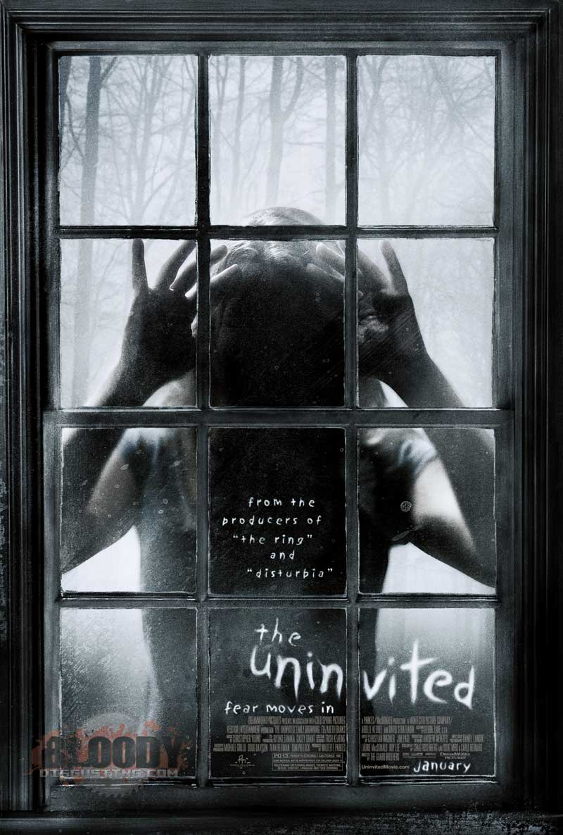
This poster is similar to alot of others, it has a lack of colours and a gloomy spooky feeling. The window and the misty atmosphere add to the scary effect. The use of the figure is good as the audience cant see the appearance of the person or who they are and they appear to be trying to get to something or someone inside the house and look like a shadow or a silhouette, which encourages the audience to see the film, to see who it is and what the film is about. The poster also has trees and a gloomy forest in the background, this is a central point of alot of horrors and by this we know it is a horror. The title of the film is in the style of someone writing on a dirty window, and is clear and bright and stands out. A tagline is used and is located under the title. In the centre pane of glass, we see it is darker and there is text which says the producers of the film made two other horrors that a lot of people would know, this automatically entice horror fans to see the film, this text is the same style as the title and date. The small print is not easy to read, and puts the focus on the large image and text. The poster also contains a date for the film is in the design of the title. It also has a tag line which is located under the title, it is small but stands out as it is bright compared to the gloomy background.
'The Silence of the lambs'

This magazine cover shows the audience straight away that he is the villain or the bad-guy as he has a sharp sinister facial expression and is wearing a mouth guard, in which we can tell he is a cannibal and has been caught after eating people, this automatically tells the audience that it is a horror related movie, he also looks to be captured and isolated from people, and the audience will want to see the film and see how he got caught and if he killed people. Again the use of blacks and reds resemble evil and violence, and the title in gold on the cover which says 500 greatest movies of all time, this will entice audiences to see it. The masthead is half covered up by the image, as this grabs the most attention. There isn't many cover lines on the cover and only a little bit of text, which is small and not as easy to see. The title of the film is positioned on the bottom of the cover and is highlighted in gold and stands out. The use of numbers on the cover are big and bold and draws readers in.
'Halloween'
This film poster is very easy to identify as a horror movie. The audience can tell as they see this big resemblance of an evil face and a knife as a weapon. The large face is in the effect of a pumpkin and twists the idea of the festivity of Halloween and turns it into a real life violent version. You can see a hand holding a knife therefore the viewers know there is a murderer and is preying on his victims on Halloween, the audience know it is a man because the tagline tells you he is a man but hides his appearance with the image of a pumpkin with a carved face in it. In the face we see the bright orange colours of a pumpkin used on the festive night but also see flames and a red tint this represents the fear and violence within the person. Everything on the poster stands out as it is all large and bold and is on a dark background. The tagline is also big and bold and adds a horror effect.
'SFX Horror' magazine

This magazines creates the gritty, violent horror theme for the readers and would automatically grab the attention of horror film fans. The magazine uses three horror icons as its main image and the audience will know who they are, and shows their faces to help the horror theme. The magazine has a 'teared' and 'bloodied' theme which applies to the genre of the magazine. The magazine sticks to using main colours and uses a gloomy blue for the background to make the characters stand out, uses red and white for text in order for it to be bold and stand out and goes with the blood effect on the magazine. The cover lines are all the same font but different from the masthead of the magazine. The masthead is bright and looks lit up this stands out the most on the page. The word horror is the biggest on the cover twice as this is the main focus for the magazine and grabs the readers attention straight away as well as the image. The magazine also uses free gifts and pullouts to maximise the potential customers it gets and readers. The subheadings are horror related and use phrases to apply to the theme of the magazine.
Film Trailers - Horror
Paranormal Activity 3 (2011)
This trailer helps to anticipate the audience for the next film in the popular trilogy and has horror and suspense in the trailer, this is a good trailer for horror fans. The trailer uses cutaways and sounds to add to the suspense, it also uses the effect of cameras and video footage to create the horror theme. The trailer cuts from everyday life to paranormal occurrences, using cutaways and camera footage to scare the audience. The trailer is for a popular horror, the trailer adds to the expectation of the audience and fans.
The Orphan
This traler was good and gave us as a group a lot of inspiration for our initial storyline plan, it is a good storyline and is similar to what we want to do as it contains a small innocent child but has a dark secret hidden. This trailer will have the same effect as our planned trailer.
The Ring (2002)
This trailer is quiet and adds sounds and suspense to scare the audience, it shows different people throughout the film and the thing that is killing them. This is a good horror trailer and builds anticipation for the audience. The trailer is good as it adds suspense and tension to create the scary effect for the audience. The trailer contains alot of footage and builds up to the scary parts of the film.


